Today the market consolidated on decreased volume, and the short-term direction is unknown. Let's see how it goes tomorrow.
2.3.0 NYSE High-Low Index. It is oversold, so the chance of market rising tomorrow is a bit high, but not entirely sure.
1.3.7 Russell 3000 Dominant Price-Volume Relationships. The dominant price-volume relationship today is 1383 stocks went up on decreased volume, which is very bearish. However it should not be overly relied on because of the big candle yesterday. Here I just remind you the pattern of Dominant Price-Volume Relationship: if the market goes up tomorrow, the probability of selling-off on the next day will be very high. Of course the market could drop tomorrow. You may check the comments in red quote boxes on the chart for more information.
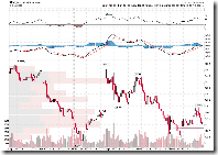
1.0.4 S&P 500 SPDRs (SPY 15 min). Here is why SPX pulled back before the market was closed -- it hit the resistance. Tomorrow it may challenge the resistance again.
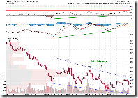
1.1.A PowerShares QQQ Trust (QQQQ 15 min). Over the short term QQQQ looks bullish because of the falling wedge as well as the positive divergence of MACD and RSI.
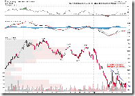
However, don't be excited because QQQQ may go another direction. I think the following chart 5.7.3 Technology Select Sector SPDR (XLK 60 min) may be more important, and very likely the pattern is a Descending Triangle which has a high probability of breaking downward. If Tech doesn't do well, QQQQ won't be good.
3.1.0 US Dollar Index (Daily). US dollar is going up again although I have been talking about overbought for some time. The problem is that US dollar went up today and Japanese Yen pulled back significantly, while the stock market didn't go up much. This means Japanese will not have a overbought problem any longer, while US dollar will not keep overbought forever, this means the market outlook is bearish.
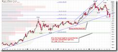
3.3.1 streetTRACKS Gold Trust Shares (GLD Weekly). The long term support line of GLD is broken, and the level at 65 could provide a support.
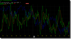
The last chart is T2101. The green curve on the chart denotes the absolute value of NYSE Advancing - Declining. If the green curve goes up, it means the difference between Advancing and Declining is increasing, consequently the trend is strong. The blue curve in the background denotes the market is going down while the green curve is going up, this means the downward trend is very strong. The market will not reverse before the downward trend gets weakened which is represented by a U-turn of green curve. Therefore, the charts tells that the downward trend has a long way to go. The brown line is a moving average, which is clearer to see the trend since the green curve has more whipsaws.


