Here is a letter from Sam, who is a reader of my blog:
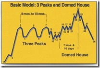
I was looking at your chart, 1.2.2, a long term monthly chart of the DOW..... it has the appearance of George Lindsay's "3 Peaks and a Domed House" pattern, which portends much lower prices on the DOW, as we would be on the final downslope.
Compare 1.2.2 to the picture of this pattern at this site: http://bigpicture.typepad.com/comments/2004/12/three_peaks_and.html
Do you agree?
Thanks for all of your work.....I like it very much! By the way.....check this chart of CVX...it is completing a 3 peak dome house, as are COP, DIG, and XOM!
http://stockcharts.com/h-sc/ui?s=CVX&p=D&yr=3&mn=0&dy=0&id=p92720173075


Thank you, Sam!